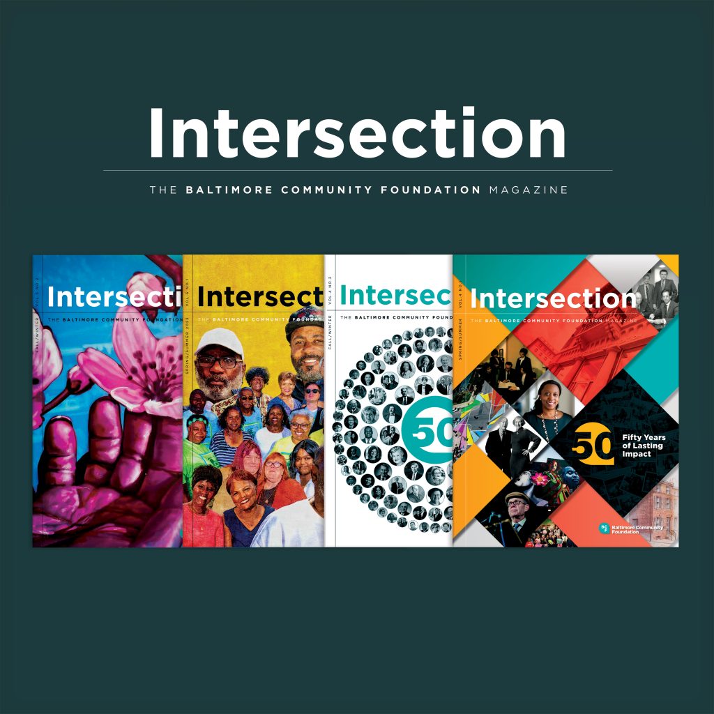
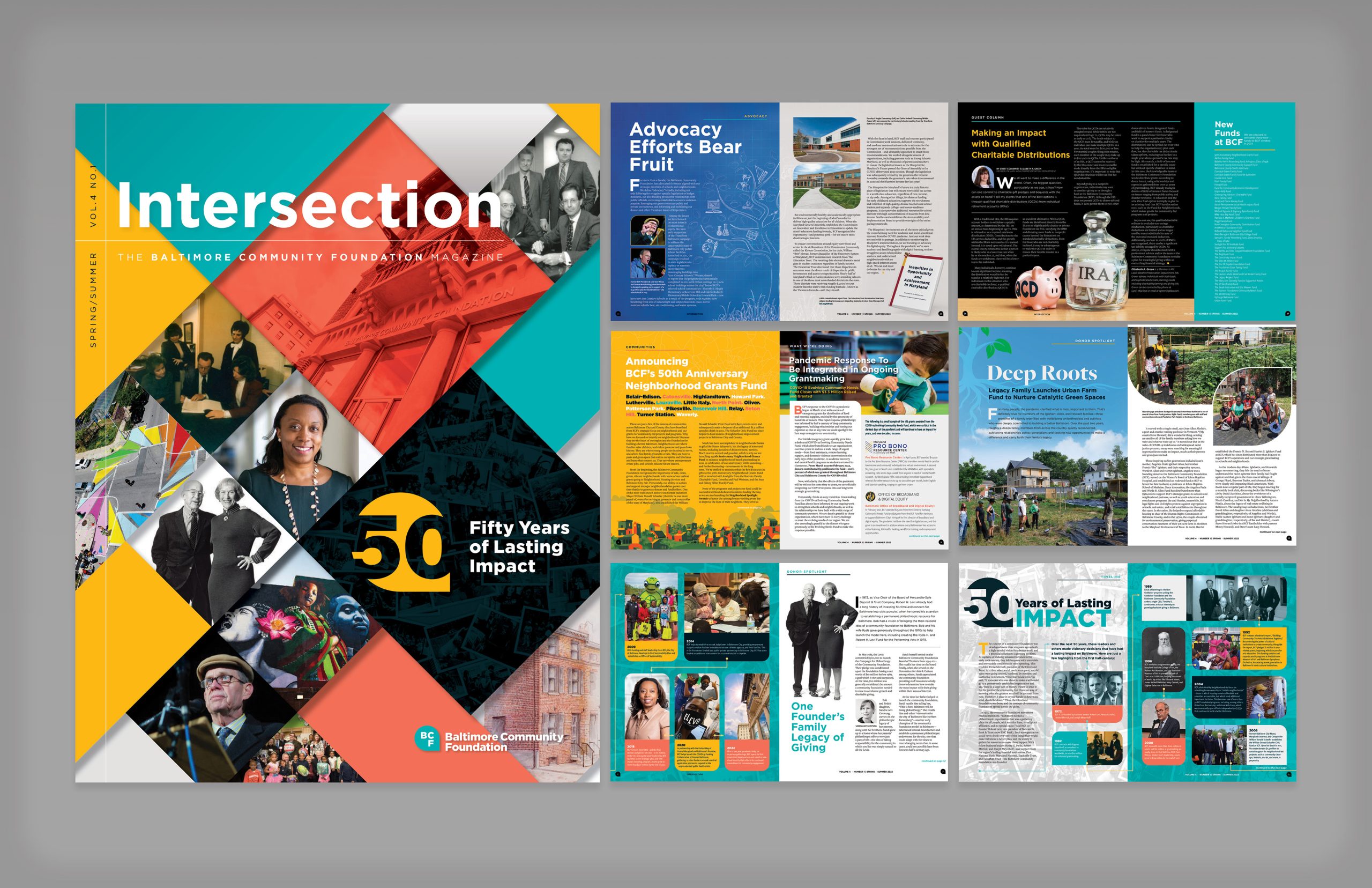
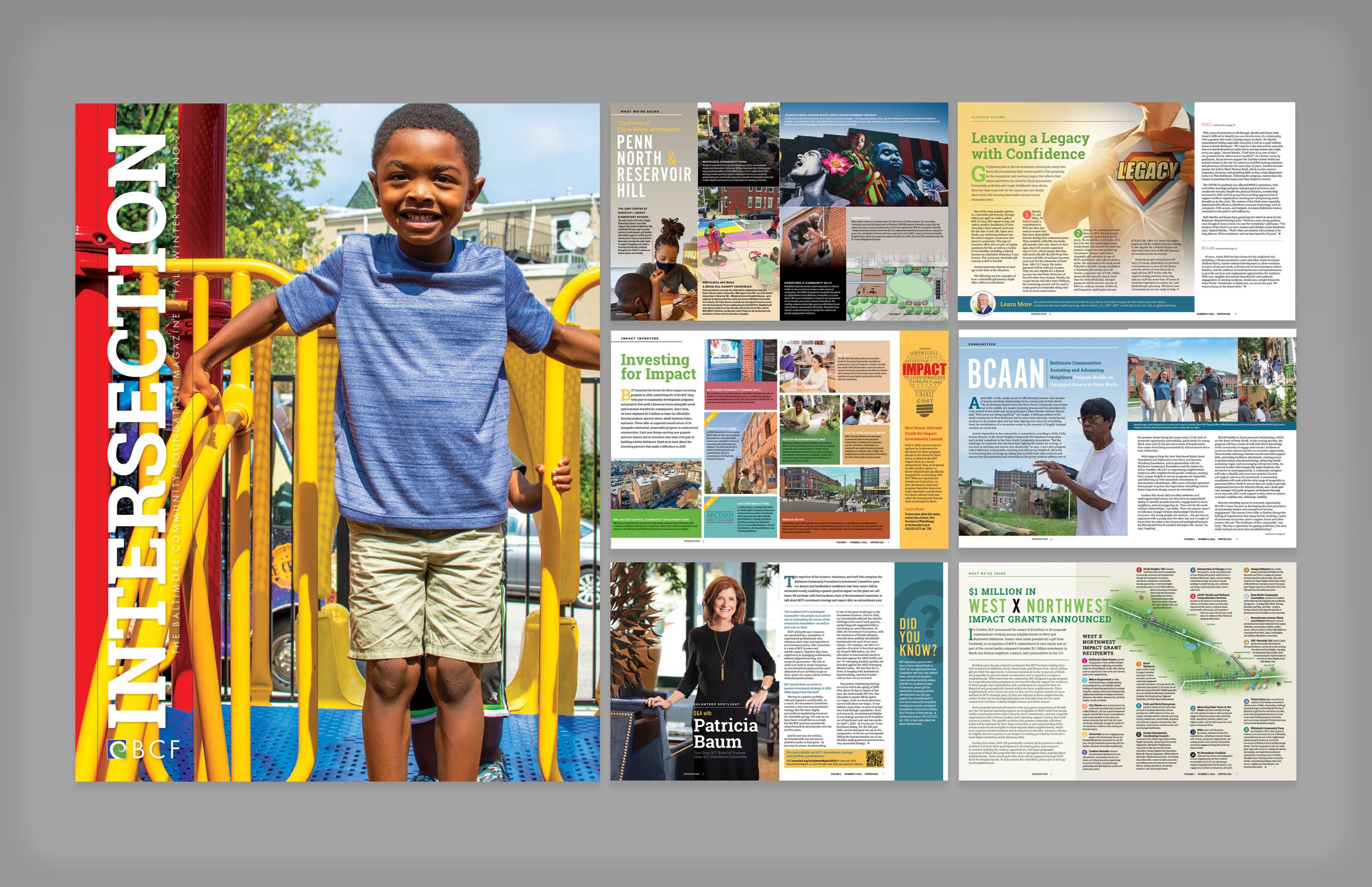
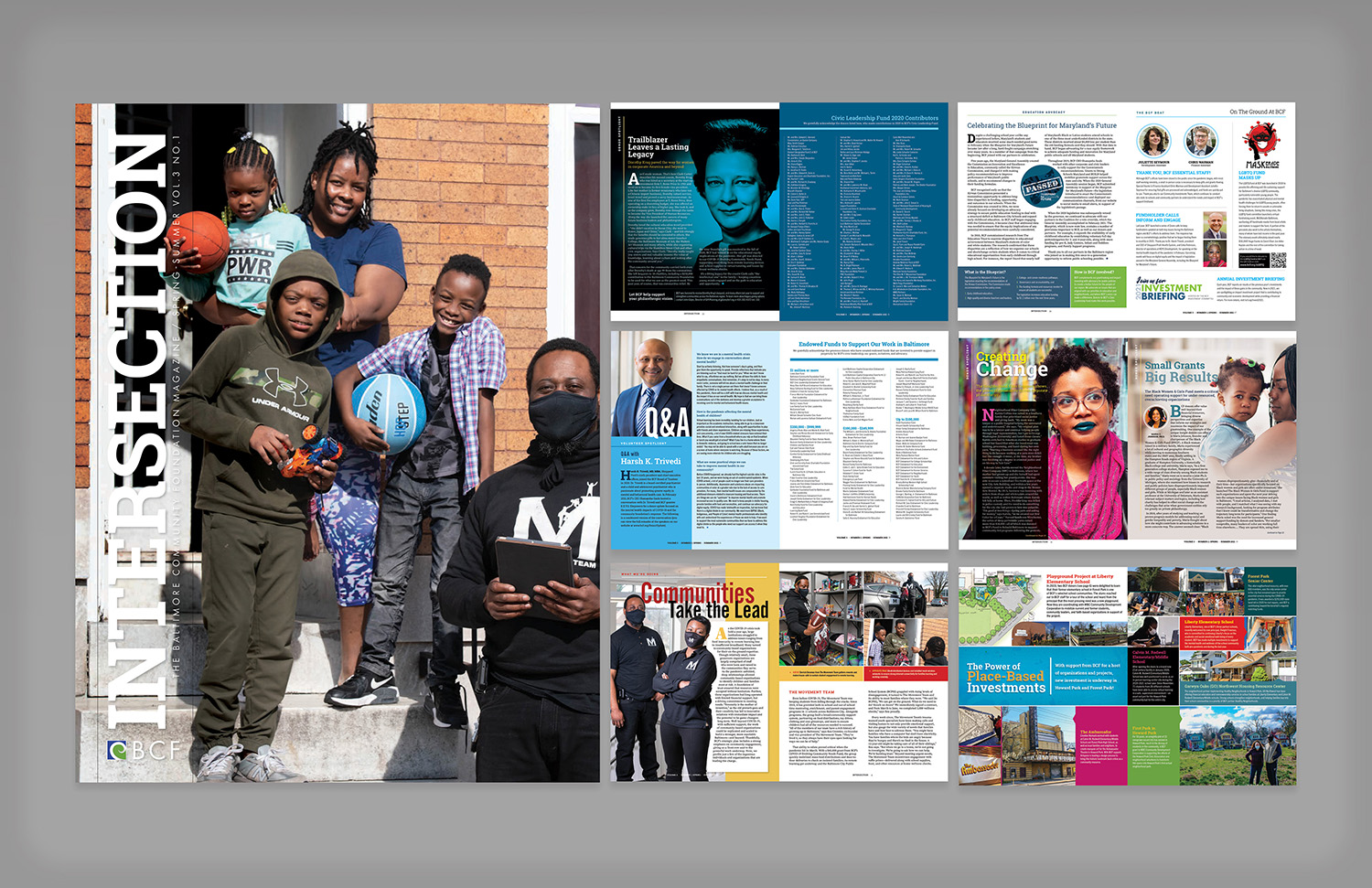
The Baltimore Community Foundation needed a print publication that could communicate the depth and range of its work across donors, grantees, civic partners, and Baltimore communities. The magazine had to do more than present updates. It needed to connect strategy, philanthropy, community stories, financial information, and organizational priorities in a format that felt polished, readable, and human.
The challenge was to create a publication system flexible enough to support feature stories, donor profiles, impact reporting, infographics, photography, and foundation messaging while maintaining a consistent editorial identity across multiple issues.
The goal was to design and produce a magazine that strengthened BCF’s storytelling, helped readers understand the foundation’s role in Baltimore, and presented donor impact and community initiatives in a visually engaging way. Each issue needed to feel credible and professional while still being accessible, warm, and rooted in the people and neighborhoods connected to the foundation’s work.
The primary audience included current and prospective donors, fundholders, nonprofit partners, civic leaders, grantees, board members, professional advisors, and community stakeholders.
The magazine also served as a broader storytelling tool for readers who wanted to better understand how philanthropy, community leadership, and local investment intersect across Baltimore.
The magazine was developed as an editorial publication rather than a basic organizational newsletter. Each issue required a balance of storytelling, information design, production planning, and brand consistency.
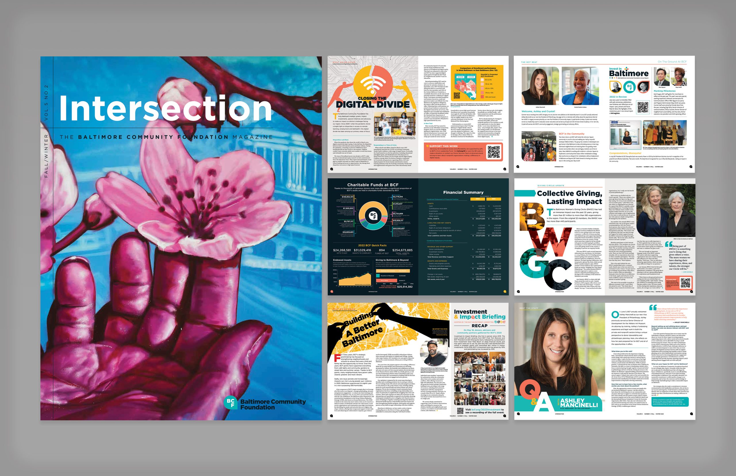
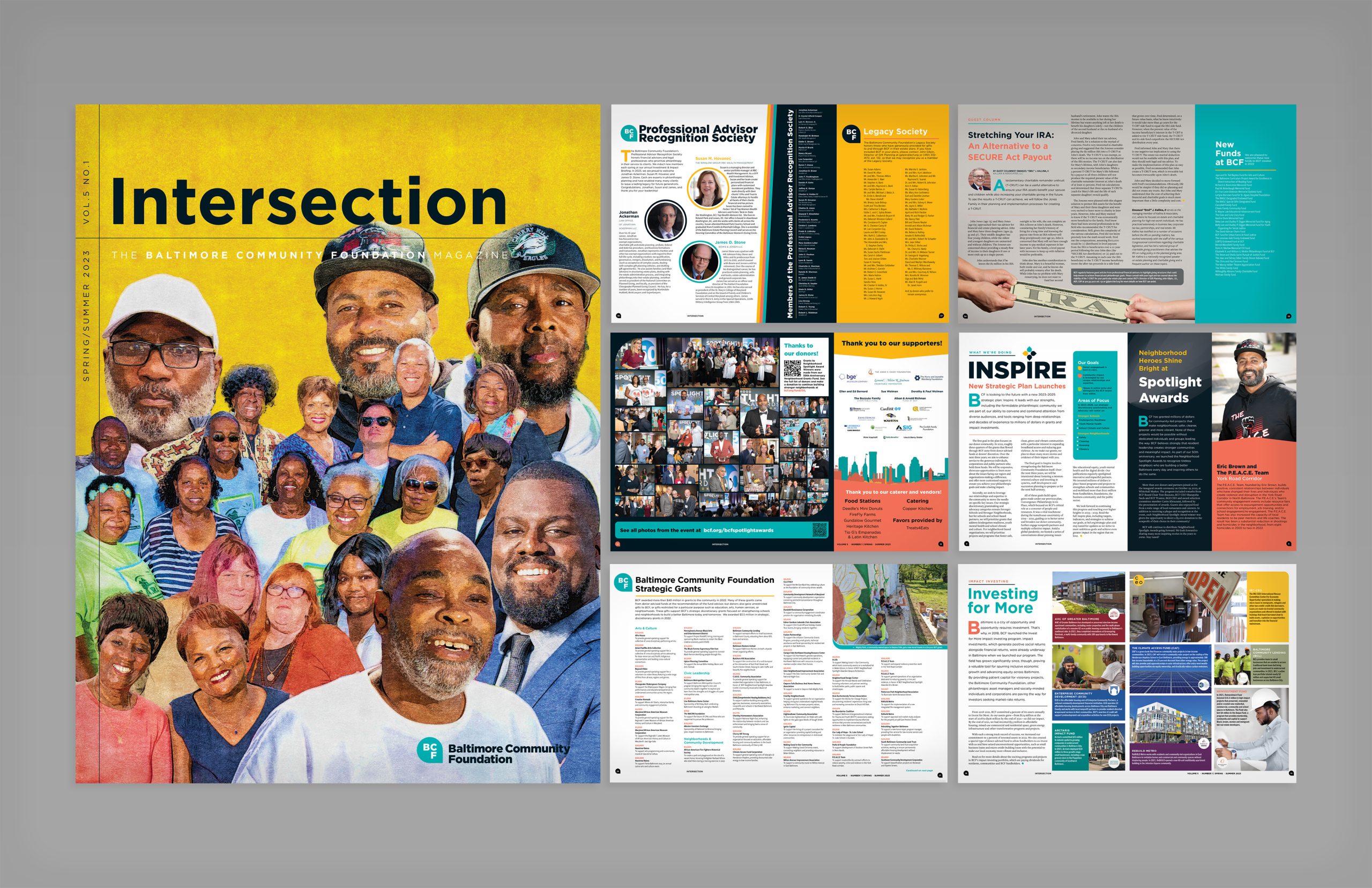
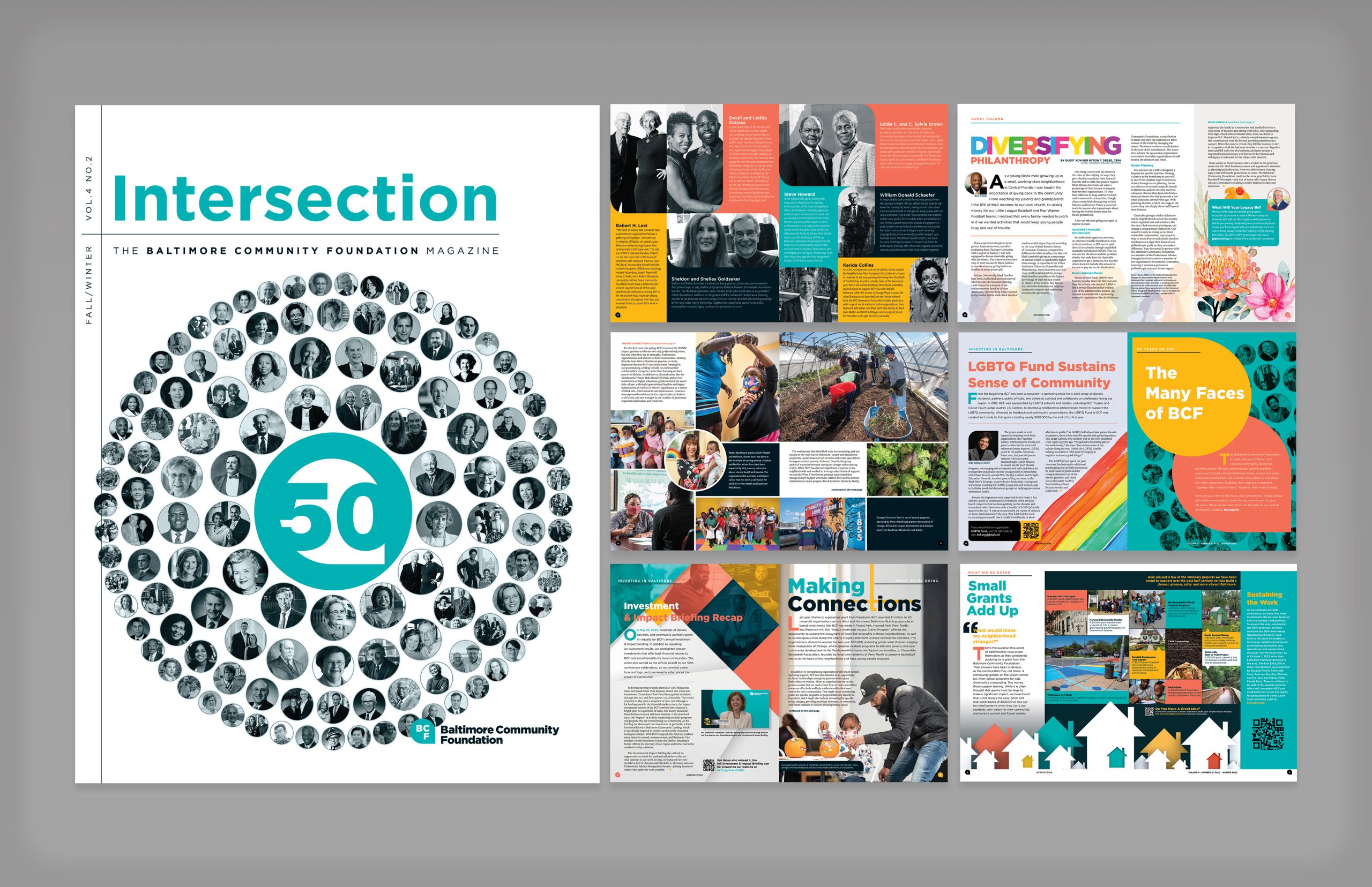
The design approach focused on giving each article a strong visual entry point while keeping the publication cohesive from cover to cover. Feature stories, donor updates, grant highlights, financial summaries, advisor recognition, and community-focused content were organized into layouts that supported both quick scanning and deeper reading.
Production included art direction, publication layout, cover design, photo editing, image composites, typography, infographics, print preparation, and vendor coordination. Photography and occasional writing were also incorporated when needed, helping the magazine maintain a consistent voice and visual quality across issues.
The creative direction combined nonprofit credibility with a more contemporary editorial feel. The magazine used bold covers, strong typography, colorful section treatments, large-scale imagery, and carefully structured spreads to make institutional content feel more dynamic and approachable.
Each issue was designed to feel connected to Baltimore visually and emotionally. Photography, illustration, community images, donor portraits, and graphic elements were used to create a sense of place while supporting the foundation’s broader themes of impact, generosity, equity, and civic connection.
Intersection became a polished print publication that helped the Baltimore Community Foundation present its work through a more engaging editorial lens. The magazine gave the organization a flexible platform for community storytelling, donor recognition, grant impact, financial reporting, and strategic communications.
The final publication system supported both storytelling and organizational credibility, helping complex foundation work feel more visible, human, and connected to Baltimore communities.